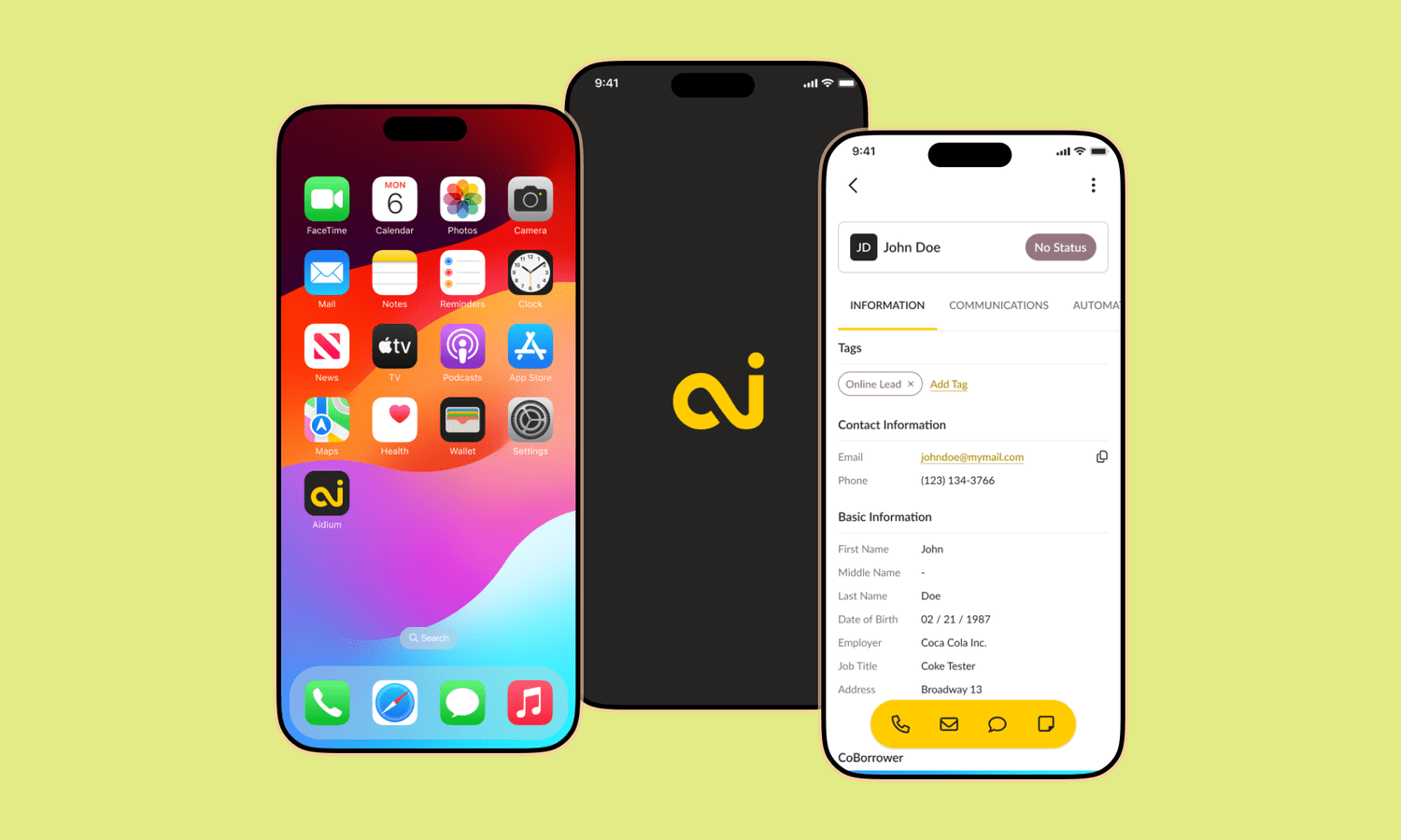
A powerful CRM on a smaller screen.
Aidium’s CRM contains a substantial set of tasks and information. Moving that experience to mobile required a navigation model that helped users reach the right place without taking over the interface.
I led the design exploration with a product manager and React engineer. The work combined user research, competitive analysis, information architecture, wireframes, and interactive prototypes.
Make alternatives comparable.
I used Figma and a component-based design system to explore multiple layouts quickly. Rather than rely on familiarity or preference alone, I built three navigation prototypes with different access patterns.
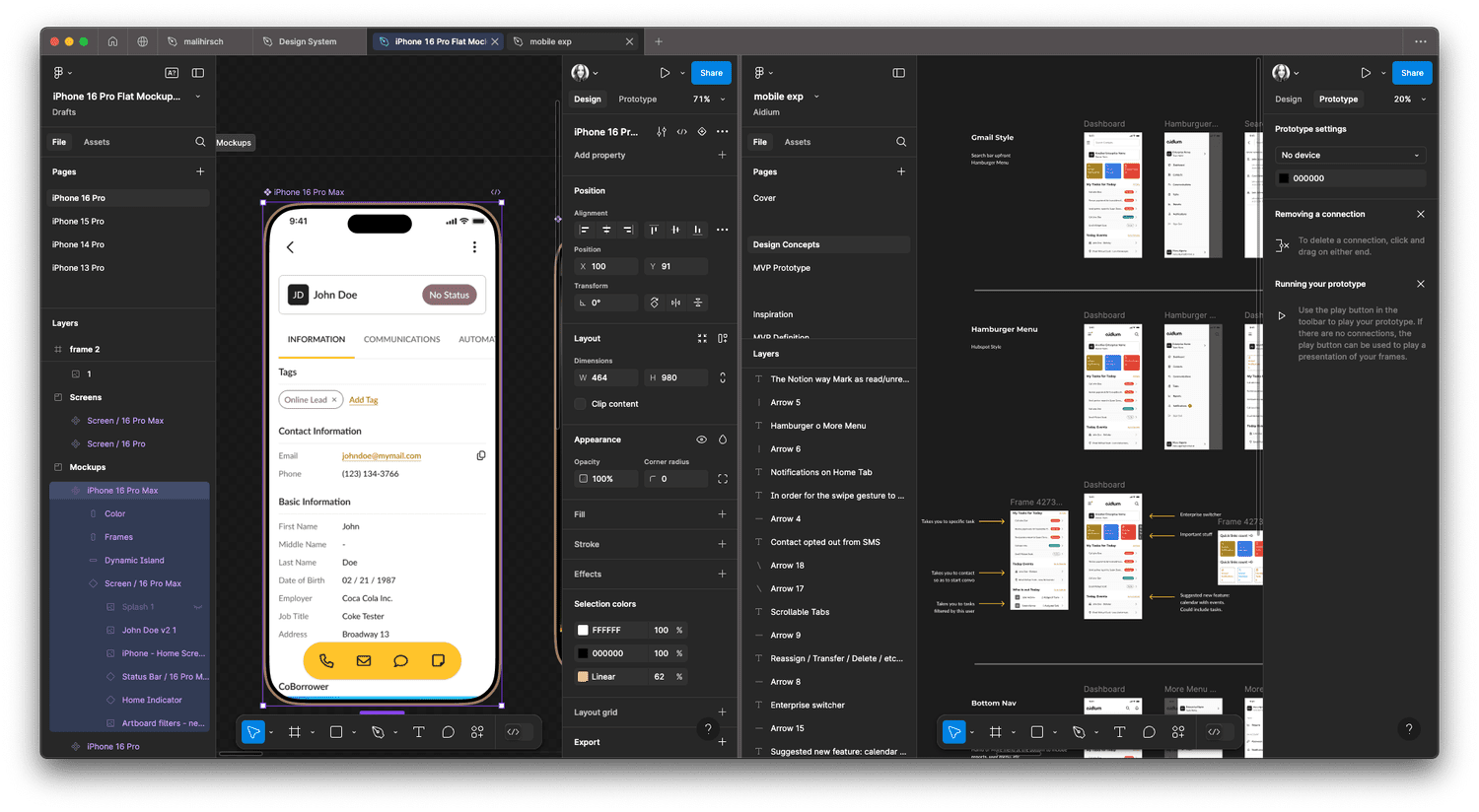
Let people use the alternatives.
I facilitated unmoderated testing with customers. Each prototype changed how users accessed navigation, allowing feedback to focus on the interaction rather than on a single static screen.
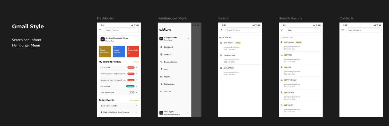
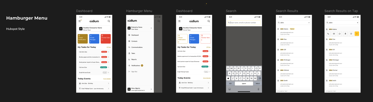
Gmail-style navigation produced confusion around overlapping options. The hamburger pattern made essential functions harder to discover. Bottom navigation received the most positive feedback for accessibility and ease of use.
Keep the core destinations within reach.
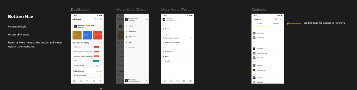
Bottom navigation became the preferred direction. Customers valued that it stayed out of the way and offered quick, intuitive access to core CRM functionality.
I refined the design based on user feedback and worked toward a consistent visual language and style guide. The decision came from comparing working alternatives with customers, rather than selecting a pattern in isolation.
A clearer route through a complex product.
The testing established a qualitative preference for bottom navigation. The work shows how rapid prototyping can make a consequential information-architecture decision tangible and testable.
The most valuable result was a navigation direction grounded in customers’ ability to find and use the functions they needed.